BWW Bowl – Collateral
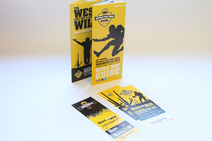
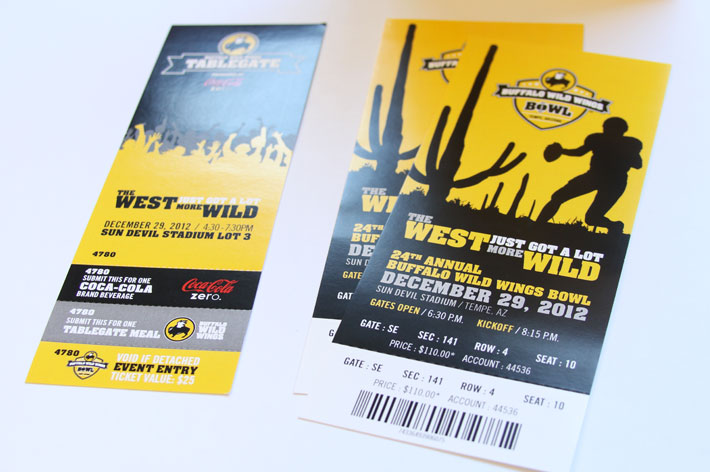
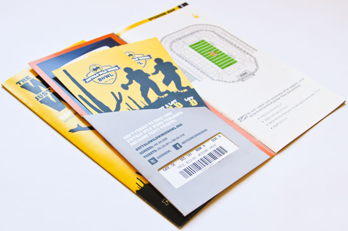
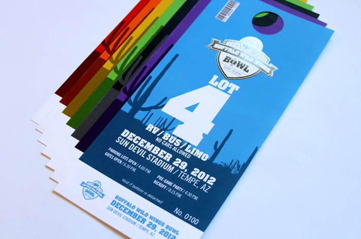
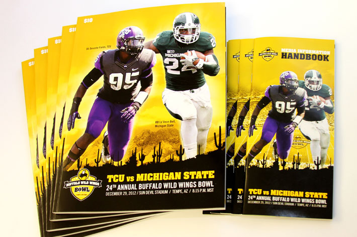
These different printed pieces show the importance of brand cohesion as well as being able to step outside the brand. When I started, it was important to strictly follow Buffalo Wild Wings style guide for color, typography, and layout. That is highlighted in the tickets, brochure, and ticket guide. I added the silhouettes to create the brand of the bowl game itself and pair that with location the game would be held, Phoenix.
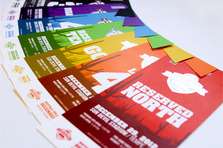
The Parking Passes made use of the typography and silhouettes, but other colors were required to quickly show the different parking areas to the parking staff. The Program Guide and Media Information Handbook, with the introduction of the teams’ star players, were a departure from the strict brand’s use of silhouettes in favor of action shots. The program guide used the mountainous background of Arizona as a background to the action, with the familiar silhouettes in the foreground. Typography, layout, and coloring made sure that these pieces felt like a part of the entire Buffalo Wild Wings Bowl brand.